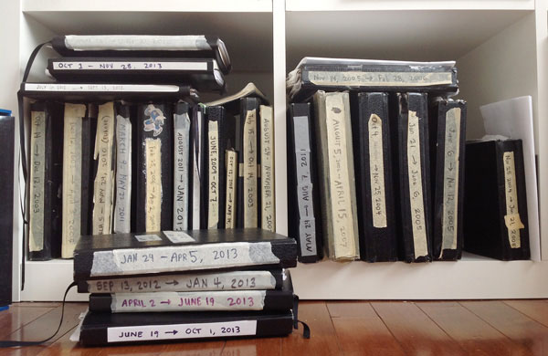
Whenever I buy a new “Art Of” book, no matter how great the concept paintings are, I often wish I could also see the earlier, rougher, uglier stuff that must exist from when the designers were still batting around ideas and trying to figure out what they were making.
On that note, here are some sketchbook pages from the past year-and-a-half of Lovers development. Working on paper, without an undo, helps to focus on the broad decision-making stuff and avoid getting bogged down in details. My sketchbook drawings have gotten rougher over the years as I’ve moved more mid-stage work to the computer, so with that warning, let’s dive in…
Enemies
For this game, enemy design is always a balance between keeping the geometric style of the game and still trying for interesting creatures. We’re also trying to hint at the gameplay of a specific enemy through their appearance, and keep enemies appropriately themed throughout the levels (which admittedly you can’t tell from this sampling).


Player characters
The players started out looking more human and more gendered, but that wasn’t really where we wanted to go so we tried to simplify them and make them more universal as we went on.
Weapon design
Designing weapons brings out the 10-year-old in me. It takes a bunch of iteration after this, though, to figure out what’s doable, let alone what’s fun to play.
Level design
Our current level tool looks like this, so for me it’s basically impossible to use creatively unless I go in already having an idea on paper of how the level should feel.

Planning work
Even for non-visual work, I can’t function without a sketchbook beside me to help organize my messy brain.

The other guys
Jamie keeps a sketchbook as well, although since he also does more coding, he ends up with lots of mathy diagrams.
Our main programmer Adam keeps a notebook too, though his artwork can be quite, uh, minimalist.


